

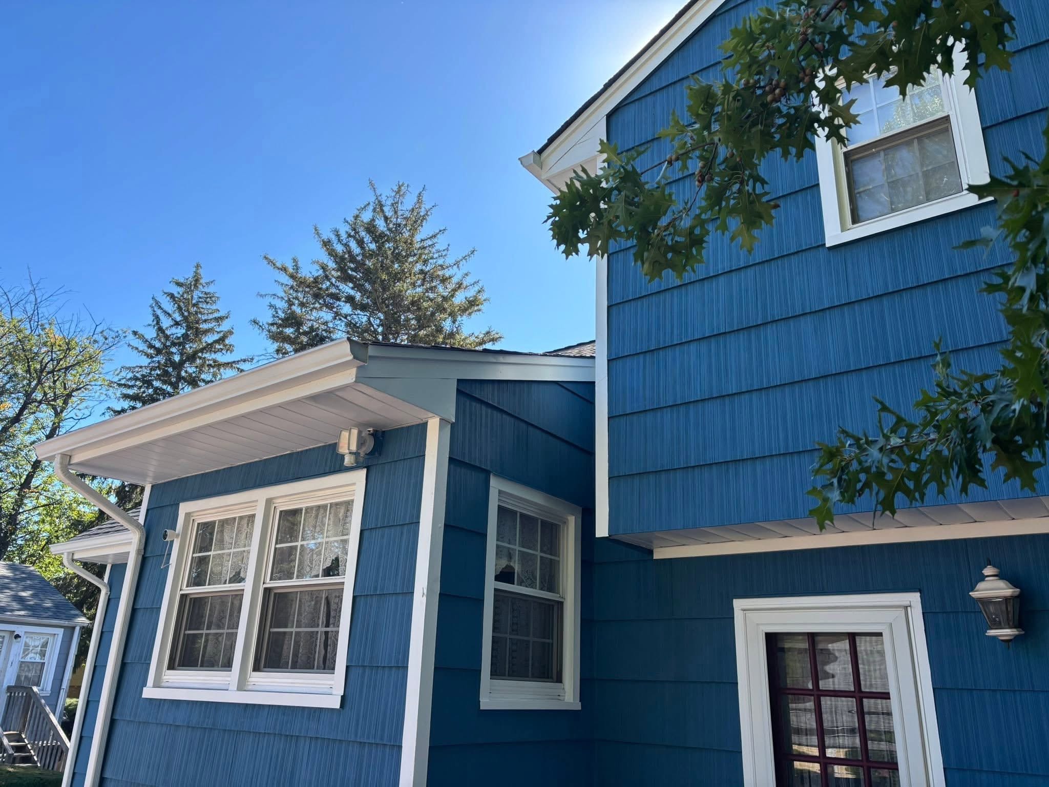
Selecting the right exterior house colors is one of the most important decisions you’ll make as a homeowner. The colors you choose don’t just enhance your home’s curb appeal—they reflect your personal style, complement your home’s architectural features, and can even increase your property’s resale value.
With 23% of homeowners choosing white for their exterior wall colors and gray coming in as the second most popular choice at 19%, neutral tones continue to dominate the landscape. But what’s the best approach for your home?
In this comprehensive guide, we’ll walk you through everything you need to know about choosing exterior house paint colors that stand the test of time while making your home stand out in all the right ways.
Understanding the Most Popular Exterior House Colors in 2026
Color trends evolve, but certain hues have proven staying power. According to recent homeowner surveys, the most popular exterior house colors break down as follows:
- White (23% of homeowners) – The timeless classic that never goes out of style
- Gray (19% of homeowners) – A versatile modern neutral that works with virtually any accent
- Beige (10% of homeowners) – Warm and welcoming, perfect for traditional homes
- Black (8% of homeowners) – Bold and dramatic, increasingly popular for modern designs
Beyond these classics, deep greens and blues are trending for 2026, offering homeowners a way to make a statement while maintaining a sophisticated look. Earthy tones like greens and browns are gaining popularity as more homeowners seek to connect their homes with the surrounding landscape.
The key to choosing exterior paint colors isn’t just following trends—it’s understanding why certain colors work and how they’ll perform over time. White paint colors have the longest longevity for exteriors because lighter colors reflect light and hold up better than darker ones.
Darker colors absorb heat and fade faster, which is an important consideration if you’re in a warm climate or your home gets full sun exposure.
There’s real physics behind why lighter colors last longer. A California Energy Commission research report on solar-reflective walls found that light-colored paints “reflect 60 percent to 90 percent of sunlight when new,” compared to well under half for most darker options—which is exactly why deep, dramatic exterior colors tend to fade and break down faster under direct sun.
— Source: California Energy Commission, “Solar-Reflective ‘Cool’ Walls” Research Report
A dramatic dark color isn’t off the table—it just means budgeting for a shorter repaint cycle than you’d get with a lighter neutral.
How to Choose Exterior Paint Colors That Complement Your Architectural Style
Your home’s architecture should be your first guide when selecting an exterior color palette. The most successful color schemes acknowledge and enhance the existing architectural styles rather than fight against them.
Craftsman and Bungalow Homes
Craftsman bungalows often use olive greens and muted browns that reference the Arts and Crafts movement’s emphasis on natural materials.
These homes look great with rich greens and deep browns that create a welcoming palette. Pair these earthy tones with warm beiges for trim to highlight the detailed woodwork characteristic of this style.
Modern and Contemporary Homes
Modern designs benefit from monochromatic palettes or stark whites that emphasize clean lines and geometric forms.
Charcoal gray and iron ore are dramatic shades for modern designs, creating striking contrast when paired with white or light gray accents. These color combinations let the architecture speak for itself without competing visual elements.
Traditional and Colonial Homes
Traditional homes should use document-authentic color schemes that respect their historical roots. Classic navy blue contrasts elegantly against white trim and wood, creating a timeless look that appeals to buyers.
A simple 2-to-3 color palette ensures architectural features stand out rather than getting lost in too many competing hues.
Restraint is the real skill on a traditional home—two or three well-chosen colors usually read as more authentic than a busier palette ever could.
Mountain and Rustic Homes
For homes in natural settings, earthy greens and warm beiges suit mountain home exteriors beautifully. These colors help the home blend into the surrounding landscape while still maintaining distinct character.
Complementary palettes should consider landscaping color to create a cohesive relationship between the home and its environment.
When selecting exterior paint color, the main body color should complement fixed elements like roofs and brickwork. Identifying roof undertones is important for coordinating exterior colors—a roof with warm undertones pairs better with warm wall colors, while cool-toned roofing works best with cool-toned paint.
What Colors Increase Home Resale Value
If you’re planning to sell your home in the next few years, certain exterior house paint colors have proven track records for boosting resale value and buyer appeal.
Neutrals like white and gray enhance curb appeal across nearly all market segments. These colors create a timeless look and appeal to buyers who want a clean slate to envision their own style. In fact, 44% of homeowners value gray or white for front doors, showing just how much buyers appreciate neutral sophistication.
Warm neutrals like beige and tan are preferred for resale value because they’re versatile enough to work with various landscaping and neighborhood aesthetics. These shades make homes look well-maintained and move-in ready—two critical factors for buyers making quick decisions in competitive markets.
Contrasting wall and trim colors are chosen by 71% of homeowners, creating visual interest without overwhelming the eye. This approach works because it highlights architectural details while maintaining broad appeal. The contrast doesn’t need to be stark—even subtle variations between your body color and trim can enhance the home’s features.
According to research from Sherwin-Williams, properties painted in neutral color palettes tend to sell faster and closer to asking price than those with bold or unconventional color schemes. While you might love that bright yellow or deep purple, buyers often struggle to see past dramatic colors when touring homes.
However, this doesn’t mean your home should be boring. A well-chosen accent color for the front door can add personality without compromising resale value. Deep hunter green, classic navy, or warm charcoal doors create welcoming statements that buyers appreciate.
There’s data behind the front-door advice specifically. In a Zillow study that showed buyers randomly assigned images of front doors in different colors, researchers found buyers “would be willing to pay, on average, $6,449 more” for a home with a black front door compared to other colors tested—with slate blue and olive green also outperforming the field.
— Source: Zillow, Front Door Paint Color Analysis
How to Test Exterior Paint Colors Before Committing
Choosing exterior colors from small paint chips is risky. Exterior colors often appear brighter and lighter in full sun, and what looks perfect on a 2-inch sample can look completely different on your entire house.
The Large Swatch Method
Testing paint samples helps see how colors shift with natural light throughout the day. Purchase sample pots of your top color choices and paint large boards (at least 2 feet by 2 feet) that you can move around your home’s exterior.
This approach, recommended by color experts at Benjamin Moore, lets you see how the color interacts with your brick, stone, windows, shutters, and other fixed elements.
Multi-Side Testing
Testing large swatches on different sides is recommended before color commitment because light conditions vary dramatically around your home. The north side gets consistent, cool light all day, while the south side experiences bright, warm sunlight.
East and west exposures shift from cool morning light to warm afternoon glow. Paint samples should be tested on each exposure to ensure you’re happy with the color in all lighting conditions.
A color that looks perfect on the south wall can look completely different on the north side of the same house—test every exposure, not just the one you like best.
The Distance Test
Step back at least 20-30 feet to evaluate your test swatches. Stand at street level where neighbors and passersby will see your home. This distance gives you a realistic sense of how the exterior paint will look in context with your roof, landscaping, and neighborhood.
Live With It
Don’t make snap decisions. Observe your test swatches for at least three to seven days, looking at them during different times of day and in various weather conditions. Colors that looked perfect on a sunny afternoon might feel too stark on a cloudy morning.
Before you settle on your final choices, take photos of your test swatches and review them indoors. Sometimes the camera catches subtleties the eye misses, and photos can help you see the colors more objectively.
What Color Combinations Work Best for Exterior Trim, Siding, and Accents
Creating a cohesive exterior color palette requires understanding how different elements work together to enhance your home’s architecture.
The Foundation: Body Color
Your body color—the primary shade covering the largest surface area—sets the tone for everything else. This is typically your siding, stucco, or brick paint. Neutrals are preferred for their staying power and versatility. Soft grays and whites create a clean backdrop that makes other architectural elements pop.
If you opt for a bolder body color, keep it in the medium to light range to avoid rapid fading. Remember that lighter colors help reduce heat retention in warm climates, which can extend the life of your paint and reduce cooling costs.
The Framework: Trim Colors
Trim includes window frames, door frames, columns, and decorative molding. Classic white trim works with virtually any body color and helps architectural details stand out. However, you can also explore variations like cream, soft gray, or even subtle warm greige for a more contemporary feel.
Warm greige and lower contrast combinations are trending for homes seeking sophisticated, understated elegance. This approach creates depth without the stark contrast of pure white trim.
The Accent: Front Door and Shutters
Your front door is the perfect place to have fun with color. Bold hues like classic navy, forest green, or warm terracotta add personality without overwhelming the overall palette. The door should complement rather than match the body color—it’s an accent, not an extension.
Shutters can either match your door for a coordinated look or match your trim for architectural consistency. Both approaches work; the choice depends on your home’s style and your personal preference.
The door is the one place on the house where “safe” isn’t necessarily the smart choice—buyers and neighbors alike tend to remember the front door more than the body color.
The Details: Garage Door, Columns, and Decorative Elements
Garage doors are often overlooked but occupy significant visual space. Generally, they should either match your body color to fade into the background or match your trim to tie in with the architectural framework.
Avoid making the garage door an accent element unless your home’s design specifically calls for it.
Decorative elements like columns, railings, and porch ceilings offer opportunities for subtle variation. A slightly lighter or darker shade of your trim color can add depth to these features without creating visual chaos.
Regional Considerations for Bergen County Homes
If you’re choosing exterior house colors for a home in Ramsey or elsewhere in Bergen County, NJ, consider your local climate and neighborhood character.
The Northeast experiences four distinct seasons, which means your paint needs to protect against humid summers, freezing winters, and everything in between.
Lighter colors reflect light and hold up better than darker ones in our region’s variable weather. Additionally, many Bergen County neighborhoods feature mature trees that create dappled shade patterns—test your colors under these real-world conditions to ensure they work in your specific environment.
At Stuart Painters, we’ve helped countless Bergen County homeowners select and apply exterior paint colors that enhance their homes’ beauty while standing up to our regional climate. Our team understands how colors perform on different siding materials common to our area, from traditional wood and vinyl to modern fiber cement.
Working with Professional Painters for the Best Results
While choosing the right exterior colors is crucial, professional application makes all the difference in longevity and appearance. Quality prep work—cleaning, repairing, priming—ensures your carefully selected hues look fresh for years to come.
Professional exterior painters bring expertise in how different paint formulations perform, which primers work best with your siding material, and how to achieve smooth, consistent coverage that DIY efforts often miss.
They also understand how to protect your property’s landscaping, windows, and other features during the painting process.
“Color is the fun part, but it only matters if the surface underneath is prepped right. I tell every Bergen County homeowner the same thing: pick a color you’ll still love in five years, and let us worry about making sure it still looks that good in five years, too.”
— Samuel, founder of Stuart Painters
If you’re ready to transform your home’s exterior with a fresh color palette, explore our exterior gallery to see examples of our recent projects throughout Bergen County. Our team is ready to help you select colors that enhance your home’s curb appeal and reflect your personal style.
Final Thoughts on Choosing Exterior House Colors
Selecting exterior house paint colors is part art, part science. The most successful palettes balance architectural authenticity with personal style while considering practical factors like climate, resale value, and maintenance.
Remember these key principles:
- Start with your fixed elements – roof, brick, stone – and choose paint colors that complement rather than compete
- Test thoroughly in real-world conditions before committing to thousands of square feet
- Keep it simple with a 2-3 color palette that lets architectural features shine
- Consider longevity – lighter neutrals protect your investment longer than dramatic darks
- Trust the process – take time to live with samples and gather feedback
Whether you choose classic white, versatile gray, or trending earthy greens, the right exterior paint color can transform your home’s appearance and create a welcoming first impression that lasts for years.
Ready to give your home a fresh new look? Contact Stuart Painters for a free estimate on your exterior painting project. Serving Ramsey, Bergen County, and surrounding areas with professional painting services since 2010.