

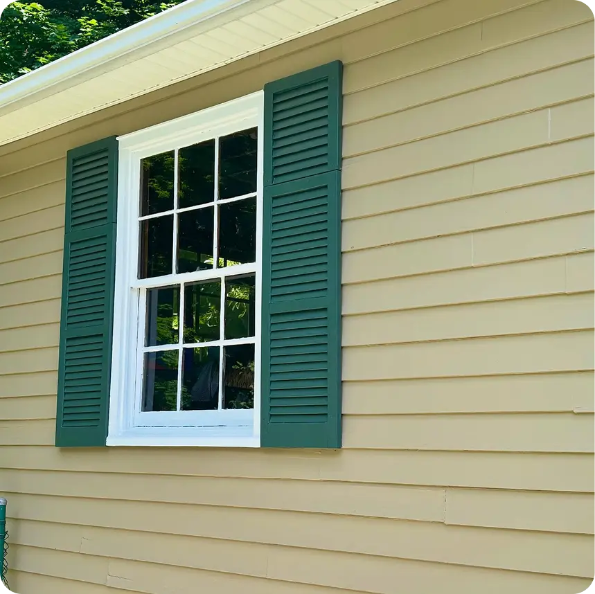
Your home’s exterior is more than just protection from the elements; it’s a reflection of your personal style and the first impression visitors get of your property. As we move through 2026, exterior paint color ideas are shifting toward nature-inspired palettes that create harmony between homes and their natural surroundings while making sophisticated statements about contemporary style.
In this comprehensive guide, we’ll explore the top color trends, show you how to create cohesive color combinations, and help you select exterior paint colors that enhance your home’s unique features while fitting beautifully within your Bergen County neighborhood.
What Are the Top Exterior Paint Color Trends for 2026?
The most significant shift in exterior paint trends for 2026 is the move toward organic, nature-inspired colors that help homes feel grounded in their environments. Popular exterior paint trends focus on organic colors that range from soft, soothing neutrals to rich, dramatic statements.
Nature-Inspired Greens
Soft Olive and Sage Greens
Soft olive and sage greens help homes blend with landscaping, creating a cohesive relationship between architecture and nature. These colors work particularly well in Bergen County’s tree-lined neighborhoods, where homes are surrounded by mature greenery.
Earthy Forest Greens
Deeper than sage but not quite dark, these mid-tone greens communicate connection to nature while maintaining sophistication. Trending exterior palettes include earthy greens that work especially well on Colonial, Cape Cod, and Craftsman-style homes.
Gray Heron
Gray Heron is trending for earthy aesthetics in 2025 and continuing strong into 2026. This complex gray-green hybrid offers the best of both worlds, the contemporary feel of gray with the organic warmth of green. It’s particularly stunning on homes with stone foundations or natural wood accents.
Moody, Dramatic Darks
Black Fox
Black Fox is a timeless choice for modern home exteriors. This sophisticated near-black creates stunning contrast when paired with crisp white trim. Dark-colored bases recede into backgrounds, enhancing greenery, making your landscaping pop while the home provides a sophisticated backdrop.
Black Satin
Dark exterior colors like Black Satin are increasingly popular, especially on contemporary and modern farmhouse styles. This deep charcoal-black offers drama without the stark severity of pure black, and it pairs beautifully with warm wood tones and brass or black hardware.
Burgundy Red
For homeowners wanting to make a statement, Burgundy Red communicates strength and durability for exteriors. This deep, sophisticated red works beautifully on historic homes, brick-accented properties, and anywhere you want a rich, confident look. It’s particularly striking when paired with cream or soft white trim.
Contemporary Blues
Pacific Blue
Pacific Blue is quickly becoming a top exterior color for 2025-2026. This versatile blue-gray works across multiple architectural styles, from coastal cottages to suburban ranches. Blue paint shades provide a calm and welcoming feel that appeals to a wide range of homeowners.
Soft Gray-Blues
Soft gray-blues make a sophisticated statement in coastal styles and contemporary homes. These colors change beautifully throughout the day as natural light shifts, appearing more blue in morning light and more gray in afternoon shadows. They’re excellent choices for homes wanting to convey tranquility and sophistication.
Evolved Neutrals
Warm Whites
Gone are the days of stark, builder-grade white. Warm whites are replacing stark whites for exterior paint, offering subtle undertones of cream, pink, or beige that feel softer and more sophisticated. Off-white remains a popular choice for home exteriors because it maintains a clean look while feeling less sterile than pure white.
Greige
Greige offers the neutrality of gray with warmth from beige, creating a perfect middle ground for homeowners who find gray too cool but beige too traditional. This hybrid neutral serves as an excellent foundation for bolder accent colors on doors and shutters.
Warm Earthy Tones
Warm earthy tones boost home curb appeal by connecting properties to their natural surroundings. Think warm taupes, soft browns, and creamy beiges with slight peach or yellow undertones. These colors photograph beautifully and appeal to the broadest range of buyers if resale is a consideration.
Which Color Combinations Create the Best Curb Appeal?
Creating beautiful home exteriors requires more than just choosing trendy individual colors—it’s about understanding how colors work together to highlight your home’s best features. Creative home exterior paint schemes balance main body and trim colors to create cohesion and visual interest.
The Three-to-Four Color Formula
Homeowners typically use three to four colors for exteriors:
- Main Body Color – The dominant shade covering the largest surface area
- Trim Color – Windows, door frames, corner boards, and fascia
- Accent Color – Front door, shutters, or architectural details
- Optional Fourth Color – Garage door, foundation, or secondary trim
This formula creates visual hierarchy and guides the eye to important architectural features without creating chaos.
High-Impact Combinations for 2026
The Modern Organic Palette
- Body: Soft Sage Green
- Trim: Creamy White
- Accent (Door): Natural Wood Stain or Deep Forest Green
- Works for: Craftsman, Ranch, and Contemporary styles
This combination helps homes blend seamlessly with natural surroundings while maintaining distinct character. The soft green provides a soothing backdrop, the creamy trim highlights architectural details, and the deeper door creates a welcoming focal point.
The Sophisticated Neutral
- Body: Warm Greige
- Trim: Bright White
- Accent (Door/Shutters): Burgundy Red or Navy Blue
- Works for: Colonial, Traditional, Cape Cod styles
Greige offers incredible versatility; it reads differently in various lighting conditions, appearing more gray in northern light and warmer in southern exposure. The crisp white trim enhances the appeal of the neutral body color, while the bold accent adds personality without overwhelming.
The Dramatic Contemporary
- Body: Black Fox or Black Satin
- Trim: Crisp White or Light Gray
- Accent (Door): Warm Wood, Brass Hardware
- Works for: Modern, Modern Farmhouse, and Contemporary styles
Dark exterior colors create a stunning visual impact and make landscaping appear more vibrant. Crisp white trim enhances the appeal of darker exterior colors by providing a sharp contrast that highlights architectural lines. This combination is guaranteed to turn heads while remaining sophisticated.
The Coastal Fresh
- Body: Pacific Blue or Soft Gray-Blue
- Trim: White or Cream
- Accent (Door/Shutters): Deeper Blue, Navy, or Natural Wood
- Works for: Colonial, Cape Cod, Coastal Cottage styles
Blue exteriors provide a calm and welcoming feel, perfect for the East Coast. The color combination evokes seaside living without being overtly nautical. It works beautifully with both traditional and contemporary architectural details.
The Warm Traditional
- Body: Warm Taupe or Soft Brown
- Trim: Creamy White or Light Beige
- Accent (Door): Rich Brown, Deep Green, or Classic Red
- Works for: Colonial, Tudor, Traditional, Brick-accented homes
Warm earthy tones create a timeless appeal that works across decades. This palette is particularly effective when your home has brick elements or stone accents, as the warm tones complement natural materials beautifully.
Using Contrasting Colors for Visual Interest
Using contrasting colors can create visual interest on exteriors without appearing busy. The key is selecting colors with different values (light vs. dark) but compatible undertones (warm vs. cool).
High-Contrast Combinations:
- Dark body + White trim = Bold, architectural definition
- Medium body + Light trim + Dark accents = Balanced, traditional
- Light body + Darker trim = Unexpected, modern twist
Low-Contrast Combinations:
- Soft gray body + Slightly darker gray trim = Subtle, sophisticated
- Beige body + Cream trim = Serene, timeless
- Sage green body + Soft white trim = Natural, organic
Contrast is a dial, not a switch—you don’t need stark black-and-white to create visual interest; a few shades of separation within the same color family reads just as intentional.
Consider neighboring color schemes when choosing exterior colors. If your neighborhood leans toward traditional whites and grays, a moody dark exterior can make your home stand out as the unique property on the block—in a good way. Conversely, if the neighborhood features colorful, eclectic homes, choosing a more subdued palette helps your property stand out through restraint.
How Do You Pair Siding Colors with Trim and Accent Colors?
Successfully pairing exterior colors requires understanding color relationships and how different elements of your home work together. Color combinations can highlight architectural styles and surroundings when thoughtfully coordinated.
Starting with Your Fixed Elements
Before selecting any paint colors, identify your home’s unchangeable elements:
Roof Color
Your roof’s undertones guide your palette. A roof with warm (brown, red) undertones pairs best with warm body colors. Cool-toned (gray, blue-black) roofs work with cool body colors. Trying to fight your roof color creates visual discord.
Stone, Brick, or Masonry
If your home features natural stone, brick foundations, or decorative masonry, your exterior paint must complement these elements. Pull colors from the stone or brick—if it has warm red undertones, choose warm paint colors; if it’s gray stone, lean toward cool palettes.
Landscaping and Natural Surroundings
Natural surroundings influence the choice of exterior colors. Homes surrounded by mature trees look beautiful in earthy greens and browns that echo the forest. Properties with open sky views can handle bolder colors like blues and darker shades.
The Main Body: Your Foundation
Your body color sets the stage for everything else. This is your largest investment and the color you’ll see most, so choose carefully.
Light Body Colors:
- Provide a blank canvas for bolder trim or accents
- Make homes appear larger
- Reflect heat in summer, potentially extending paint life
- Show dirt and require fewer coats than darker colors
- Examples: Warm whites, soft grays, pale greiges, light sage
Medium Body Colors:
- Versatile and forgiving
- Hide dirt better than light colors
- Still reflects enough light to avoid fading issues
- Offer more character than light neutrals
- Examples: True greiges, medium blues, olive greens, warm taupes
Dark Body Colors:
- Create dramatic, contemporary style statements
- Make architectural details pop when paired with light trim
- Require premium paint formulations and more frequent touch-ups
- Make landscaping appear more vibrant
- Examples: Black Fox, deep navy, charcoal, burgundy
Trim: The Framework
Trim includes window casings, door frames, corner boards, fascia, and any architectural molding. Your trim color should complement your body color while providing enough contrast to highlight these features.
Classic White Trim:
The most versatile trim choice, white works with virtually any body color:
- Creates crisp, clean lines
- Highlights architectural details
- Provides maximum contrast with dark bodies
- Timeless and broadly appealing
Cream or Warm White Trim:
Softer than pure white, these work beautifully with warm body colors:
- Less stark contrast than bright white
- Complements warm neutrals, greiges, and earthy tones
- Creates a more cohesive, subtle look
- Perfect for traditional and country styles
Gray Trim:
A contemporary alternative to white:
- Works with both warm and cool body colors, depending on the gray
- Creates a lower contrast, more sophisticated look
- Pairs beautifully with blues, greiges, and greens
- Adds modern edge to traditional architectural styles
Matching Body Trim:
Using the same color for body and trim creates a:
- Streamlined, modern appearance
- Larger-appearing home (no visual breaks)
- Contemporary aesthetic
- Blank canvas to showcase landscaping
This approach works best with high-quality siding and good architectural proportions—any imperfections become more noticeable.
Accents: The Personality
Your front door and shutters (if applicable) provide an opportunity to inject personality and create a focal point.
Front Door Colors:
The door is your home’s handshake; make it memorable:
- Bold Choices: Deep navy, burgundy red, forest green, burnt orange
- Classic Choices: Black, glossy red, natural wood
- Trendy Choices: Soft blush, sage green, warm brass-painted
- Safe Choices: Match trim color for cohesion
Shutter Colors:
Shutters should either match the door for coordination or match the trim for architectural consistency:
- Match door: Creates symmetrical focal points
- Match trim: Emphasizes windows and architectural rhythm
- Contrast with both: Possible but requires careful color selection
Garage Doors:
Often overlooked, garage doors occupy significant visual space:
- Match body color: Door “disappears” into the facade
- Match trim: Coordinates with architectural framework
- Accent color: Only if the garage is secondary to the home’s front elevation
For detailed guidance on coordinating multiple colors, Benjamin Moore’s exterior color guide provides excellent visualization tools and professional color advice.
What Colors Work Best for Different Home Styles?
Architectural styles have evolved with specific color palettes that highlight their distinctive features. While you can certainly break these “rules,” understanding traditional approaches helps you make informed decisions.
Colonial and Traditional Homes
These classic architectural styles benefit from time-honored palettes:
Traditional Approach:
- Body: Warm white, soft gray, colonial yellow, or classic blue
- Trim: Crisp white or cream
- Accents: Deep red, navy, black, or forest green doors
- Shutters: Typically match the door or use traditional black
Modern Update:
- Body: Warm greige, soft sage, or sophisticated gray-blue
- Trim: White or soft cream
- Accents: Burgundy red, warm wood door, or deep charcoal
Colonial homes often feature symmetrical facades with centered doors and evenly spaced windows. These architectural styles benefit from color combinations that emphasize this symmetry rather than fight it.
Ranch and Mid-Century Modern
These horizontal, sprawling homes handle color differently:
Classic Approach:
- Body: Warm earth tones, soft browns, or muted greens
- Trim: Natural wood, matching body, or subtle contrast
- Accents: Bright door colors (yellow, orange, turquoise) or natural wood
Contemporary Update:
- Body: Warm greige, soft olive, or sophisticated taupe
- Trim: Match body or use subtle, darker contrast
- Accents: Bold geometric door color, natural wood, or black
Ranch homes often have large horizontal siding that benefits from fewer coats of higher-quality paint. The low-slung profile means landscaping plays a huge role; ensure your color choices complement your plantings.
Craftsman and Bungalow Homes
These homes celebrate natural materials and handcrafted details:
Traditional Craftsman Palette:
- Body: Earthy greens, warm browns, deep terracotta, or olive
- Trim: Cream, natural wood, or slightly darker complementary shade
- Accents: Natural wood door, deep green, or warm red
Updated Craftsman:
- Body: Soft sage, warm gray-green, or sophisticated taupe
- Trim: White or cream to highlight exposed beams and brackets
- Accents: Natural wood-stained door, deep forest green
Craftsman architectural styles feature distinctive exposed rafter tails, knee braces, and detailed porch columns that benefit from contrasting trim colors highlighting this craftsmanship.
Cape Cod and Coastal Styles
These homes traditionally embrace beach-inspired palettes:
Classic Coastal:
- Body: White, soft gray, or pale blue-gray
- Trim: Crisp white
- Accents: Navy blue, soft aqua, or natural weathered wood
Modern Coastal:
- Body: Soft gray-blue, warm white, or sophisticated greige
- Trim: White or very pale gray
- Accents: Deep navy, charcoal, or natural wood
Coastal architectural styles work beautifully with soft gray-blues that make sophisticated statements while evoking seaside living. These colors look particularly stunning in Bergen County’s varied natural light.
Contemporary and Modern Homes
These architectural styles embrace bold, clean-lined aesthetics:
Dramatic Modern:
- Body: Black Fox, deep charcoal, or stark white
- Trim: Minimal—often matching body or high-contrast white
- Accents: Natural wood, bold orange/yellow, or metallic hardware
Sophisticated Contemporary:
- Body: Sophisticated greige, soft gray, or warm taupe
- Trim: Slightly darker or lighter monochromatic shade
- Accents: Natural materials, black, or unexpected pop colors
Contemporary style homes often feature mixed materials (wood, metal, stucco) that serve as the “color variation” rather than traditional paint colors. Keep the palette simple and let materials and architecture create visual interest.
Tudor and Historic Homes
These distinctive homes require respectful color treatments:
Traditional Tudor:
- Half-timbering: Natural dark brown or black (usually original wood)
- Stucco sections: Cream, warm white, or soft beige
- Accents: Deep colors that complement the dark wood—burgundy, forest green
Historic Home Guidelines:
- Research period-appropriate palettes for your home’s era
- Choose colors that enhance rather than compete with architectural details
- Consider historic district regulations if applicable
How Do You Choose Colors That Stand Out While Fitting Your Neighborhood?
Balancing individual expression with neighborhood harmony requires thoughtful observation and strategic color selection.
Reading Your Neighborhood
Before making final color decisions, take a walk or drive through your immediate area:
What to Notice:
- Dominant color families (mostly neutrals? Mix of bolds and neutrals?)
- Architectural style variety (uniform development or eclectic?)
- HOA restrictions (if applicable—check regulations before starting)
- Natural landscape (wooded? Open? Established or new development?)
Colors appear differently under various lighting conditions and in relation to surrounding homes. What looks perfect on a paint chip may read completely differently when your house is nestled between a white colonial and a gray ranch.
Reading the neighborhood before committing to a color isn’t just aesthetic caution—it’s backed by how real estate professionals actually see buyers respond. The National Association of Realtors’ Remodeling Impact Report found that 92% of REALTORS® suggest sellers improve curb appeal before listing, and 97% consider it important in attracting a buyer in the first place. — Source: National Association of Realtors, “Remodeling Impact Report: Outdoor Features”
Strategies for Standing Out Appropriately
The Sophisticated Departure:
If your neighborhood is predominantly neutral (whites, grays, beiges), you can differentiate with:
- A trendy body color from the same family (warm greige instead of builder beige)
- A slightly darker or lighter value than neighbors (charcoal gray instead of medium gray)
- A nature-inspired color that still reads as sophisticated (soft sage instead of beige)
The Bold Accent:
Keep the body color similar to the neighborhood, but make a statement with:
- A dramatic front door color (burgundy red, Pacific blue, deep forest green)
- Contrasting shutters if neighbors don’t have them
- Thoughtfully chosen architectural accents in unexpected shades
The Thoughtful Contrast:
Choose a completely different color family, but ensure it’s:
- High-quality and well-executed (cheap-looking paint undermines any color)
- Appropriate for your architectural style
- Coordinated with fixed elements (roof, stone, brick)
- Not so bold it negatively impacts neighbor property values
Testing Your Choices in Context
Never commit to exterior colors without proper testing:
Use Paint Samples:
Use paint samples to test colors before final selection. Paint large sample boards (minimum 2′ x 2′) and view them:
- At different times of day (morning, noon, late afternoon, evening)
- On different sides of your house (north-facing vs. south-facing)
- Next to fixed elements (roof, stone, existing landscaping)
- From street level, where neighbors and passersby will see it
Digital Visualization:
Many paint manufacturers offer apps that let you visualize colors on photos of your home. While not perfectly accurate, these tools help you explore options before investing in samples.
Gather Feedback:
Show your sample boards to trusted neighbors, family, and friends. You don’t need to follow their advice, but hearing concerns early helps you address potential issues before painting 2,000 square feet.
When to Consult Professionals
Color selection is surprisingly complex. Professional color consultants can:
- Identify your home’s undertones and recommend compatible palettes
- Navigate HOA restrictions and neighborhood expectations
- Suggest unexpected combinations you wouldn’t have considered
- Save you from costly mistakes requiring repainting
“Color consultation isn’t an upsell we tacked on—it’s part of the job. I’ve seen homeowners fall in love with a swatch that looks completely different once it’s on 2,000 square feet of siding in real Bergen County light. A short conversation before the paint gets ordered saves everyone a repaint.” — Samuel, founder of Stuart Painters
At Stuart Painters, we offer color consultation services as part of our painting packages. Our team has painted hundreds of homes throughout Bergen County and understands which color combinations work best in our specific climate and neighborhood contexts.
Premium Paint Formulations for Trending Colors
Choosing beautiful colors is only half the equation; selecting the right paint formulation ensures those colors look beautiful for years to come.
Dark Color Considerations
If you’re choosing moody darks like Black Fox, deep navy, or charcoal:
Premium Formulations Required:
Dark colors need high-quality paint formulated specifically for color retention:
- Higher pigment concentration prevents fading
- UV inhibitors protect against sun damage
- Flexible binders accommodate temperature changes without cracking
- May require fewer coats than cheaper alternatives despite the higher upfront cost
There’s fresh peer-reviewed science behind why dark, saturated colors need better formulations. A 2025 study on paint pigment photodegradation found that organic pigments are “susceptible to degradation when exposed to prolonged” light exposure, with measurable color fading and binder breakdown showing up in accelerated aging tests—exactly the mechanism that shortens the life of a dramatic dark exterior without a premium, UV-stable formulation. — Source: “VIS-Light-Induced Degradation of Street Art Paints and Organic Pigments,” Applied Sciences (MDPI), 2025
Maintenance Reality:
Dark exterior colors require more maintenance than light colors:
- Fade faster due to heat absorption
- Show imperfections, peeling, and dirt more visibly
- Need touching up every 2-3 years vs. 5-7 for lighter shades
- Require power washing more frequently
A dramatic dark exterior isn’t a one-time decision—budget for touch-ups roughly twice as often as you would with a light neutral, and the drama stays worth it.
The dramatic impact is worth it for many homeowners, but go in with realistic expectations about upkeep.
Nature-Inspired Greens and Blues
Earthy greens, sage tones, and blue-grays need specific formulations:
Look for:
- Fade-resistant formulas with UV protection
- Mildew-resistant additives (especially important in New Jersey’s humid climate)
- High-quality binders that prevent color shift over time
Cheaper greens often shift yellow or gray as they age. Premium formulations maintain their intended color for the paint’s full lifespan.
A green that looked perfect on day one but reads gray or yellow three years later isn’t a style choice going out of fashion—it’s usually a formulation shortcut showing up.
Warm Whites and Neutrals
Even “simple” whites require thoughtful product selection:
Quality Indicators:
- Stain-blocking properties to prevent discoloration
- Dirt-resistant finish (especially important for whites)
- Proper hide—some whites require three coats with cheap paint vs. two with premium
For detailed information about paint formulations and which products work best for different color families, consult with professional painters or paint specialists at your local paint retailer.
Bringing It All Together: Your Color Selection Process
Ready to transform your home’s exterior with trending 2026 colors? Follow this step-by-step process:
Step 1: Assess Your Starting Point
- Evaluate your home’s architectural style
- Identify fixed elements (roof, stone, brick)
- Consider your neighborhood context
- Review any HOA restrictions
Step 2: Gather Inspiration
- Browse exterior paint color ideas online and in neighborhoods you admire
- Save images of homes with similar architectural styles to yours
- Consider trending palettes but filter through your personal preferences
- Visit paint retailers to explore options and collect chips
Step 3: Narrow Your Choices
- Select 3-4 body colors that fit your style and architecture
- Choose 2-3 trim color options for each body color
- Consider 2-3 accent colors for the door and details
- Ensure all choices complement fixed elements
Step 4: Test Extensively
- Purchase sample pots of your top choices
- Paint large boards (minimum 2′ x 2′) for each color
- View samples at different times of day and on different sides of your house
- Live with samples for at least a week before deciding
Step 5: Plan Your Palette
- Finalize your 3-4 color scheme
- Determine which color goes where (body, trim, accents)
- Calculate paint quantities needed
- Select appropriate finishes (satin for body, semi-gloss for trim)
Step 6: Execute with Quality
- Choose premium paint formulations appropriate for your colors
- Hire experienced professionals or commit to proper DIY prep
- Follow the manufacturer’s instructions for application and curing
- Plan for two coats minimum for lasting results
Ready to Transform Your Home’s Exterior?
The exterior paint color ideas trending in 2026 offer incredible variety—from soothing nature-inspired greens to dramatic, moody darks, sophisticated neutrals to refreshing blues. Whatever palette speaks to you, the key to success lies in thoughtful selection, quality products, and expert application.
Ready to explore your color options? Contact Stuart Painters for a free consultation and color planning session. We’ll help you navigate trending exterior paint colors, create a cohesive palette that enhances your home’s architecture, and deliver the professional results that make your vision a reality. Let’s transform your home’s exterior into something truly beautiful.